UX & Design Leader
based out of California

New DocuSign

The new DocuSign experience allows users to quickly and securely sign and send documents in minutes from anywhere. This new experience was designed to be more friendly and easier to use for our customers. View Work

UI/UX WEB RESPONSIVE
DocuSign Homepage Redesign
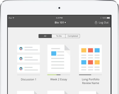
grader app ipad

Grader App

Bb Grader provides teachers with a mobile solution to conveniently measure student success anytime, anywhere. With Bb Grader, teachers use their iPads to review assignments, provide feedback, and grade on the go. View Work

UI/UX iOS

Mobile Collab

Collaborate is a Blackboard platform that allows users (students and faculty) to create virtual platforms, offices and meeting spaces. I worked specifically on the mobile product, designing both the UI and UX while working closely with developers (iOS and Android) during implementation by providing detailed specs and measurements, assets, animation comps and workflows. View Work

UI/UX iOS ANDROID
Mobile Collab iOS iphone 6
blackboard mobile helpdesk homepage

Helpdesk

Helpdesk is a responsive help website that I redesigned to meet the needs of both mobile and desktop users. Based on user feedback, users previously had trouble finding the appropriate help articles and there was no search function. I worked closely with the support team to meet user needs by making key categories more visible, so that users could easily find relevant resources. View Work

UI/UX WEB RESPONSIVE

Mobile Learn

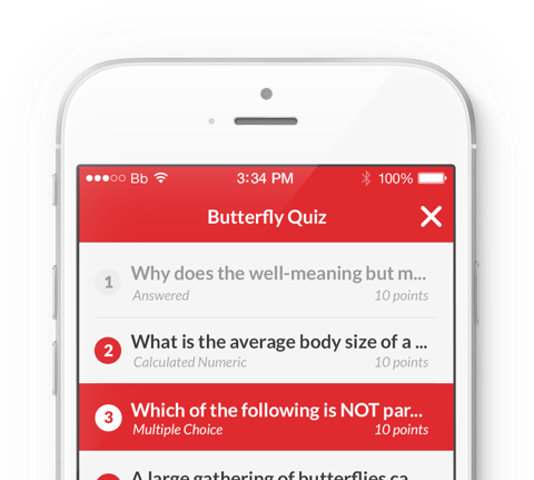
Mobile Learn allows students to access grades and other schoolwork on the go. I worked collaboratively with the design team to create the UI/UX and all assets. In particular, I focused on the tablet experience (the initial design was for small format devices) while working closely with engineering to iterate on ideas and provide detailed specs and assets. View Work

UI/UX iOS ANDROID
Mobile Learn tests iOS iphone 6

Moderica

Moderica is an original typeface design and process book inspired by modern architecture. In creating Moderica, my goal was to combine linear geometry while maintaining a warm and human feel. The typeface is intended for use on buildings and signage. View Work

PRINT TYPOGRAPHY
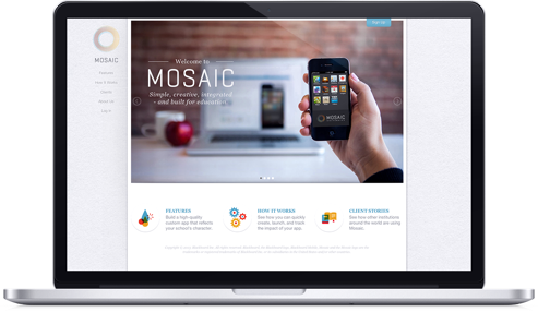
mosaic homepage

Mosaic

Mosaic is an application that allows institutions to build custom apps. I worked directly with the marketing team to come up with content, creating layouts and graphics for both the desktop and mobile site as well as the html and css. View Work

UI/UX WEB MOBILE

Webby Awards

10 second bumper ads for the annual Webby Awards categories. Video categories are different yet linked by a common underlying aesthetic. Fundamental elements such as lines, circles, and squares, combined with a monochromatic color scheme. View Work

MOTION
univers typography poster

Univers Poster

Univers was designed by Adrian Frutiger in 1956 and released by the Deberny & Peignot type foundry in 1957. It is a neo-grotesque sans serif; it features optically even stroke weights and a large x-height to improve legibility... View Work

PRINT TYPOGRAPHY